直接將此元件拖拉至畫布上欲插入Filterable Gallery位置。 #
此元件與專業功能–藝廊相類似,除了可篩選展示圖片外;特色為可針對各別圖片各自設定不同連結連至不同頁面 / 網頁,因此更能多元運用在產品篩選或文章 / 最新消息的篩選。
插入元件–Filterable Gallery:

點選Filterable Gallery段(螢光處)可編輯「段」佈局、樣式、進階功能。
將游標移到欄內圖片處點擊,或於右上角出現編輯Filterable Gallery符號,點選進入編輯Filterable Gallery。
編輯Filterable Gallery–內容 #
雖為艾利思ELLIS提供進階元件工具,但點選編輯Filterable Gallery後,顯示編輯Filterable Gallery,一樣包含內容、樣式、進階。
Filterable Gallery–內容:可分為Settings、Filterable Controls、Gallery Items、Load More Button 。
編輯Filterable Gallery–內容–Settings #
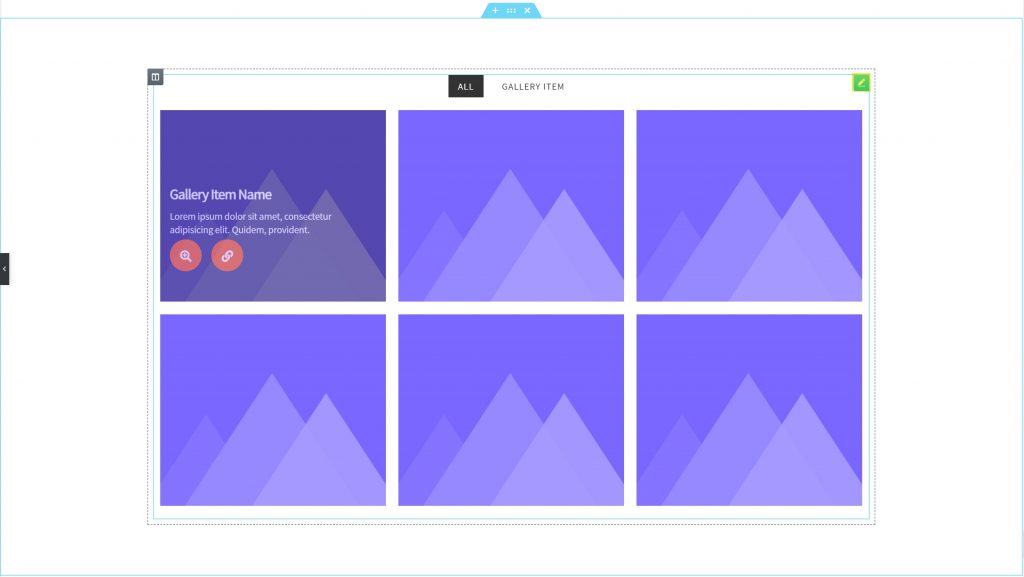
編輯Filterable Gallery–內容–Settings,針對元件本身顯示項目數、圖片高度、佈局、樣式、連結等設定。
Layout:可分為Overlay(項目標題與內容以覆蓋形式呈現在圖片上)、Card(項目標題與內容以卡片樣式於圖片下方呈現)、Search & Filter(於圖片上方呈現搜尋篩選條)。
Link to:連結至其他頁面或網頁時,採點選按鈕(顯示按鈕圖示)或直接點擊整張圖片。
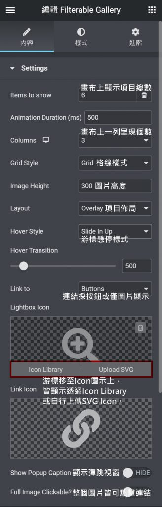
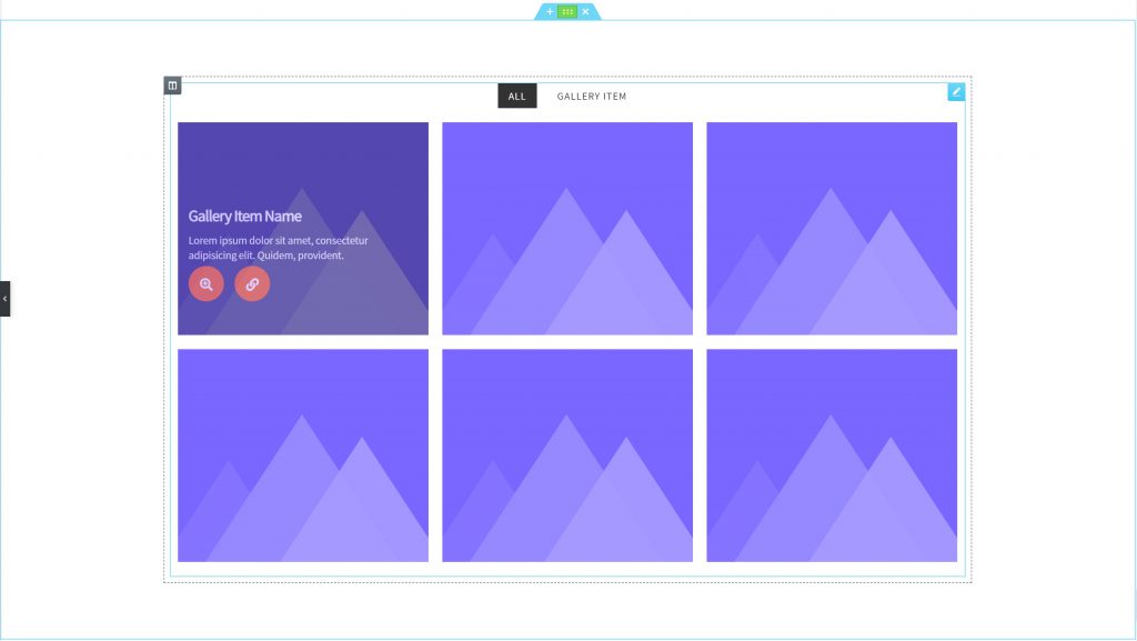
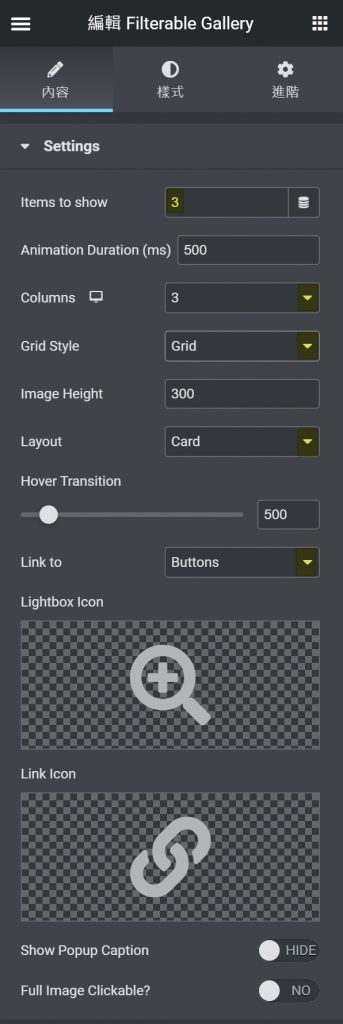
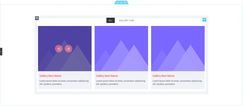
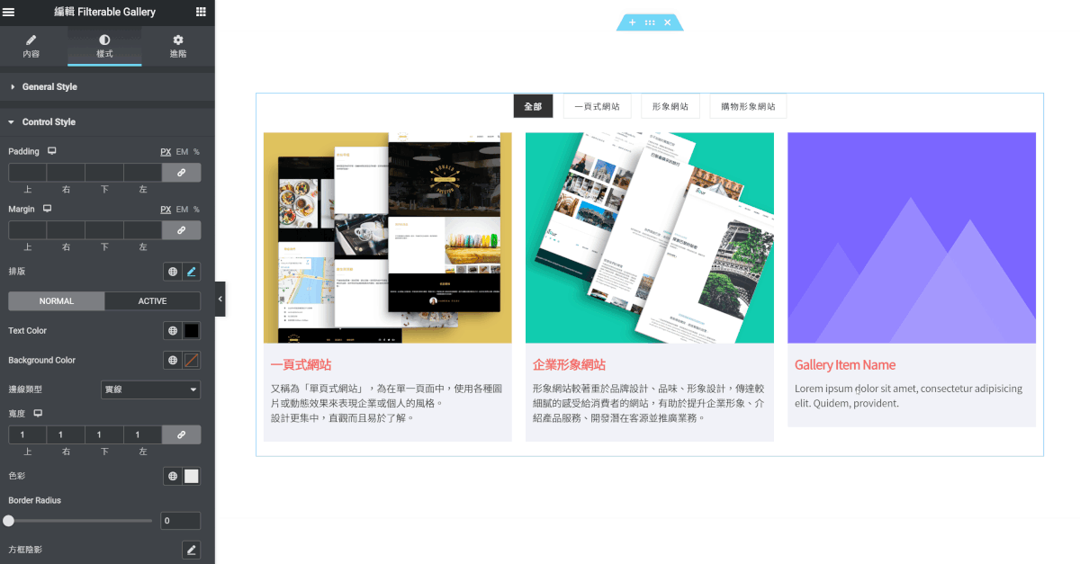
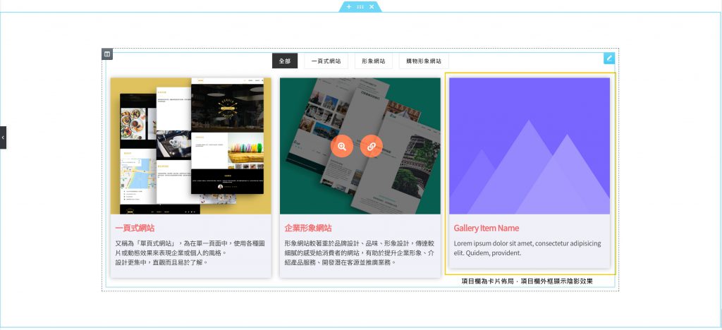
範例將編輯Filterable Gallery–內容–Settings,選擇總顯示數(Items to show)為3項,佈局(Layout)改為卡片(Card),並將連結(Link to)設為按鈕(Buttons),則游標移至圖片上時將出現按鈕Icon。
畫布上呈現卡片佈局,顯示欄數為3項,且連結選擇按鈕,因此當游標移至圖片時,出現放大圖片按鈕與連結按鈕。
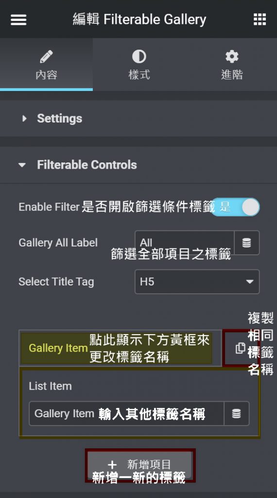
編輯Filterable Gallery–內容–Filterable Controls #
編輯Filterable Gallery–內容–Filterable Controls,新增並設定篩選標籤。
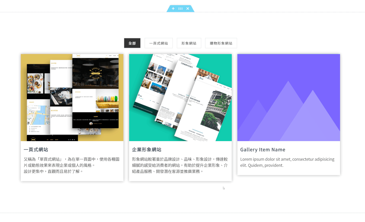
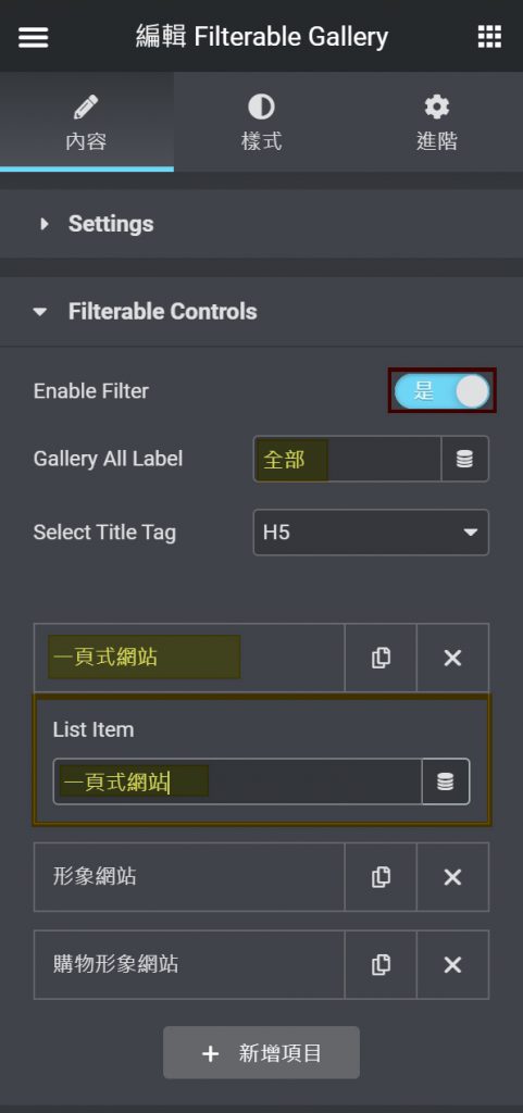
範例將編輯Filterable Gallery–內容–Filterable Controls,將Gallery All Label重新命名為全部,並增加一頁式網站、形象網站、購物形象網站等篩選控制標籤。
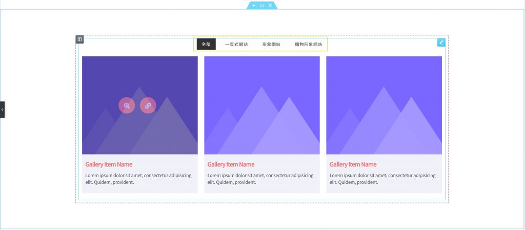
對應於畫布上Filterable Gallery,於上方(黃框)顯示所輸入的篩選控制標籤。
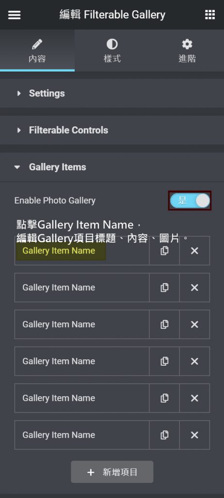
編輯Filterable Gallery–內容–Gallery Items #
編輯Filterable Gallery–內容–Gallery Items,針對主要項目,設定項目的篩選控制標籤、標題、內容、圖片與連結等。
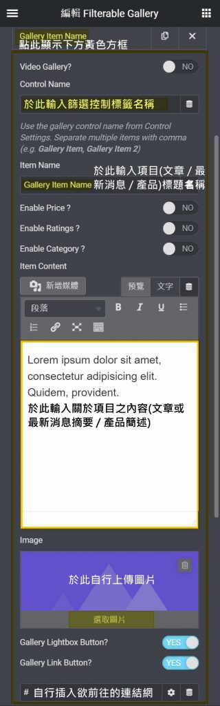
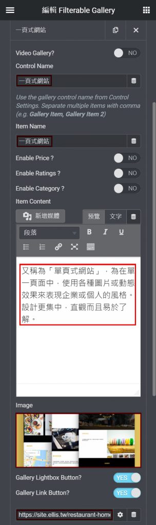
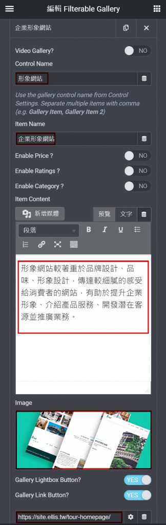
編輯Filterable Gallery–內容–Galley Items範例一,不開啟Video Gallery,並將篩選控制標籤(Control Name)設定為一頁式網站,將項目標題名稱(Item Name)設為一頁式網站;將範例二之篩選控制標籤(Control Name)設定為形象網站,將項目標題名稱(Item Name)設為企業形象網站;並各別輸入項目相關內容,於Image上傳圖片;開啟Button;各別插入連結的網址。
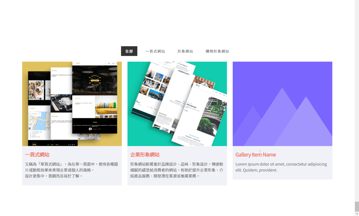
對應於編輯Filterable Gallery–內容–Gallery Items 所設定的標題內容與圖片;由於開啟Lightbox Button、Link Button,游標移至項目圖片上顯示Lightbox Button(放大Icon按鈕)與Link Button(連結Icon按鈕),點擊按鈕圖示可以放大或連往其他頁面。
範例於Gallery Items 項目中設定Control Name及Button,於畫布上點選篩選標籤與按鈕效果。
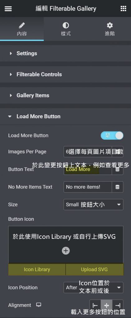
編輯Filterable Gallery–內容–Load More Button #
編輯Filterable Gallery–內容–Load More Button,是否於項目下方顯示載入更多按鈕;開啟後得編輯按鈕文本、大小以及按鈕前或後是否設置Icon。
範例將Load More Button關閉。
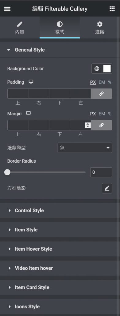
編輯Filterable Gallery–樣式 #
各元件於樣式版面,功能大致相同,主要為調整每個元素中各元件的顏色或尺寸。
編輯Filterable Gallery–樣式,針對Filterable Gallery段內所有元素內容:General Style、Control Style、Item Style、Item Hover Style、Video Item Hover、Item Card Style(依照Layout選擇顯示)、Icon Style 等選單設定。
編輯Filterable Gallery–樣式–General Style #
General Style,調整畫布上Filterable Gallery整個元件欄的背景顏色,元件欄與項目內的間距,元件欄外框是否設有邊線,元件欄是否設有圓角,元件欄外框是否設陰影。
範例搭配白色背景故不做其他調整,使用者得依照網站配色做搭配。
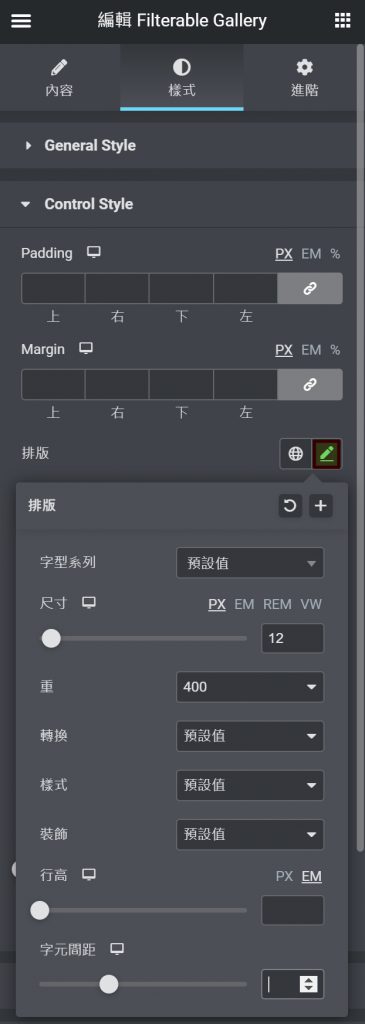
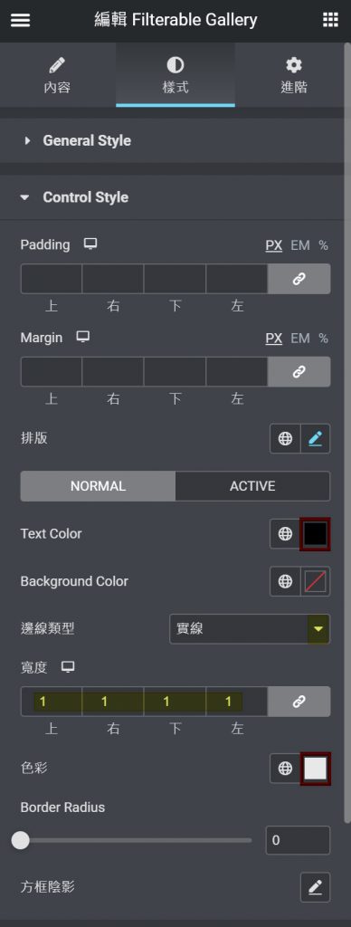
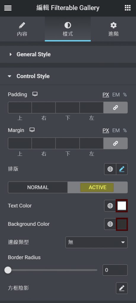
編輯Filterable Gallery–樣式–Control Style #
Control Style,對應於編輯Filterable Gallery–內容–Filterable Controls設定的標籤,調整標籤間的距離,標籤文本排版(字型、尺寸、粗細、大小寫、斜體、底線、行高、字與字間距等)、文本顏色、標籤背景顏色,標籤背景是否設定邊線、圓角或陰影效果。
範例將標籤文本調整尺寸為12PX、字體粗細為400,文本顏色改為黑色,設定標籤外框為實線、寬度1、並將邊線顏色設為淺灰色;另調整ACTIVE,亦即當游標點擊篩選控制標籤時的動作顏色,將標籤文本動作顏色改為白色、標籤背景動作顏色改為類黑色。
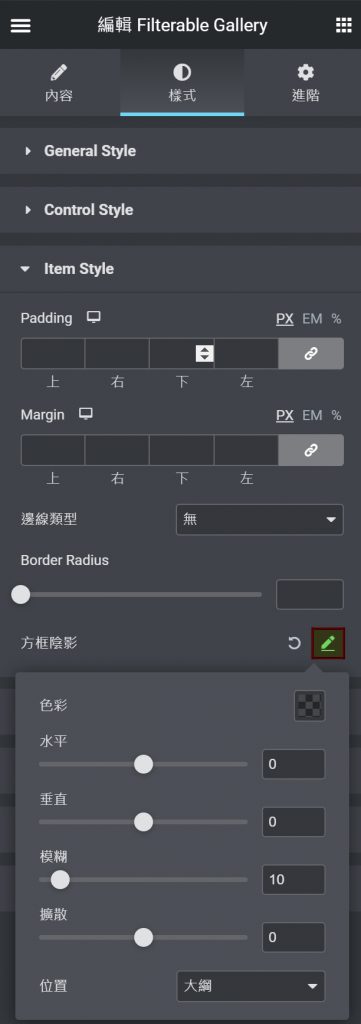
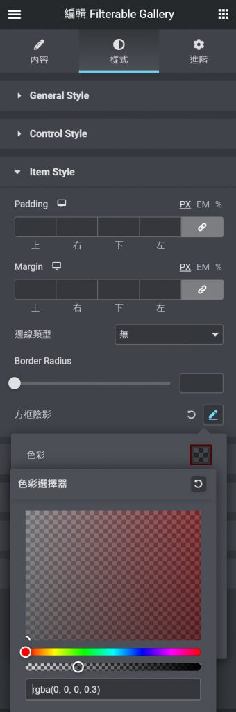
編輯Filterable Gallery–樣式–Item Style #
Item Style,調整畫布上Filterable Gallery之項目欄,調整項目與項目間的距離,項目欄外框是否設有邊線、圓角及陰影效果。
點選方框陰影編輯(左圖),編輯陰影相關色彩與位置設定,若想進一步調整方框陰影的色彩,點選色彩(右圖),透過色彩選擇器拖曳或輸入色碼調整。
範例將項目欄外框設為陰影,並將陰影色彩調亮為較淺的陰影。
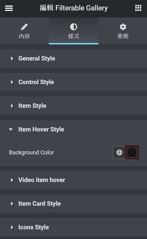
編輯Filterable Gallery–樣式–Item Hover Style #
Item Hover Style,調整畫布上Filterable Gallery項目圖片上的覆蓋顏色。點選色彩方框調整圖片上覆蓋的顏色。
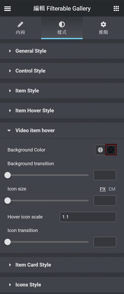
編輯Filterable Gallery–樣式–Video Item Hover #
Video Item Hover,若於編輯Filterable Gallery–內容–Gallery Items 中選擇開啟為Video Gallery,則於樣式–Video Item Hover,可以調整影片圖片背景覆蓋顏色、撥放器Icon大小等。
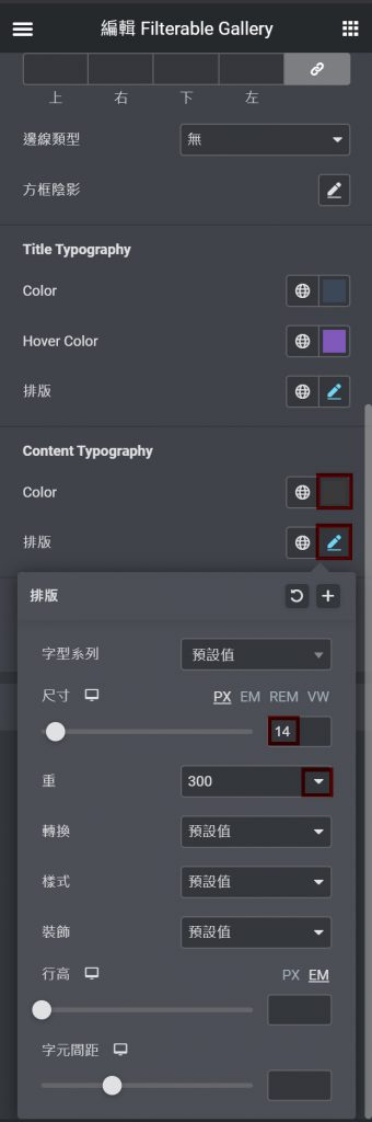
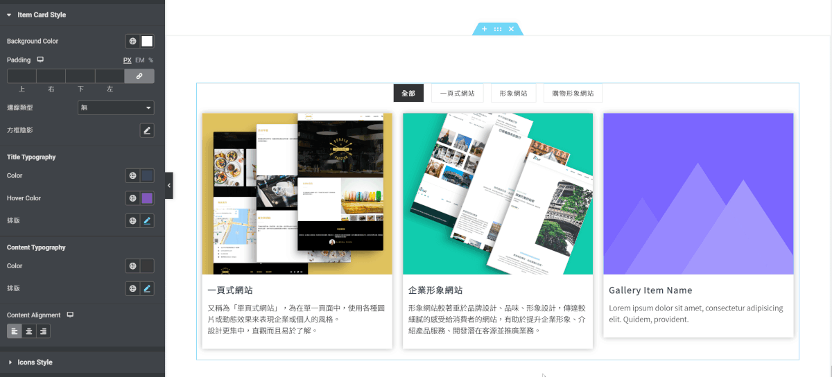
編輯Filterable Gallery–樣式–Item Card Style #
Item Card Style,若於Filterable Gallery–內容–Settings–Layout(佈局)選擇卡片佈局,則於樣式中顯示Item Card Style區塊;針對主要項目調整卡片背景顏色、文本與卡片的間距、卡片是否設有邊線或陰影;及標題文本的顏色、排版以及游標懸停時的顏色;內容文本的顏色及排版;標題與內容文本的位置。
範例將卡片背景調整為白色;並將標題文本顏色設為深藍色、懸停時標題變為紫色,並設定文本尺寸為16PX、重為600、字元間距為1;而內容文本顏色設為深灰色,文本尺寸14PX、重為300。
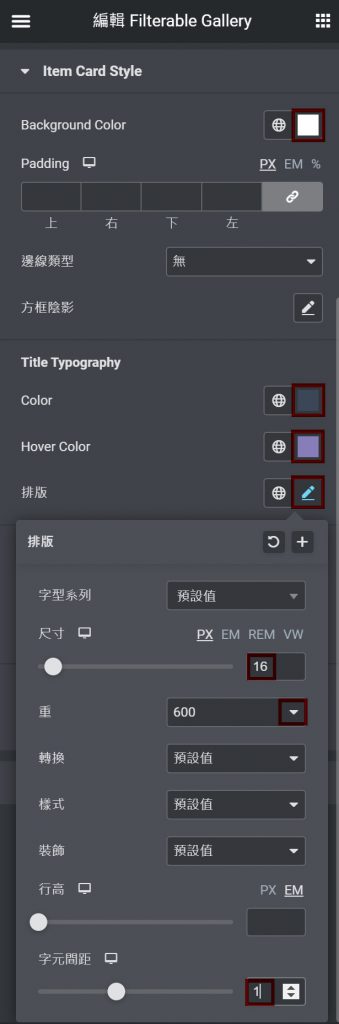
畫布上依據Filterable Gallery–樣式–Item Card Style設定,卡片背景變為白色,標題為深藍色,且當游標移置標題時,標題因懸停顏色呈現紫色。
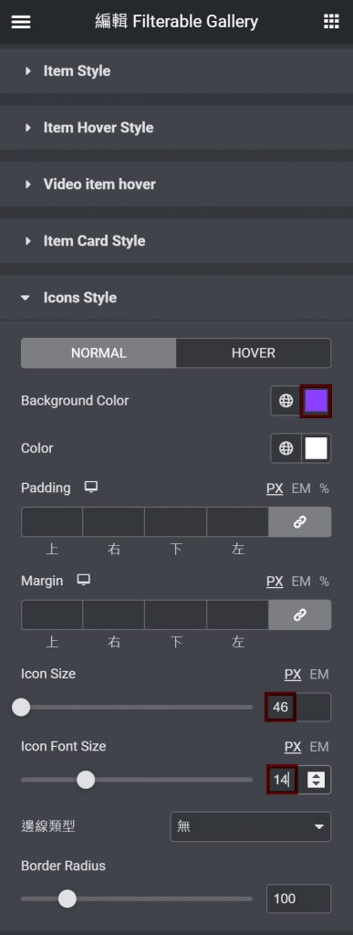
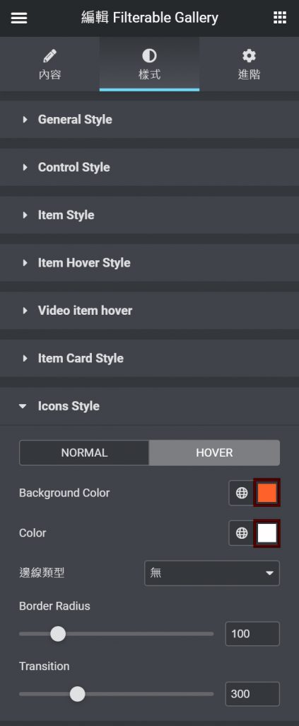
編輯Filterable Gallery–樣式–Icon Style #
Icon Style,若於編輯Filterable Gallery–內容–Gallery Items 中選擇開啟Gallery Lightbox Button 與 Gallery Link Button,則於樣式中,可以調整Icon背景顏色與Icon本身顏色;當游標停在Icon時,Icon背景顏色與本身顏色的懸停顏色;Icon間的間距;Icon按鈕尺寸與Icon本身尺寸;Icon按鈕是否設有邊線及圓角。
範例將Icon按鈕背景顏色調為紫色,並將按鈕尺寸調為46PX,按鈕本身尺寸為14PX;當游標停在按鈕時,按鈕將變為橘色。